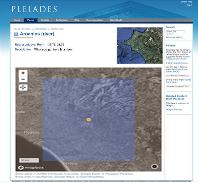
How Pleiades pages look:
How Pleiades pages should look:
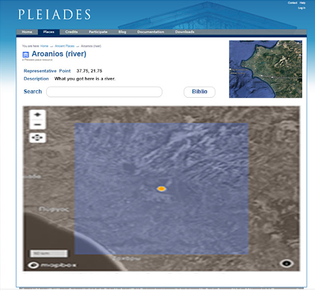
In the revised version we've done away with the annoying zoom-in-from-outer-space and settled on a nice large map. Context which is lost by being zoomed-in is restored with the new spotter map which you see on the upper right. The spotter map is zoomed out (level 4,5?) so that you can tell at a glance where you are in the world.
All the ridiculous back-scratching, log-rolling, and mutual thank-yous are moved off to one of the tabs on the top. Users can click on that tab if they want to see whose bright idea this site was but - spoiler alert - they won't. I left the bibliography off of this new map but there is room for one or a button that will pop the bibliography up on a new window. New windows for subsidiary purposes are easy to write and not enough advantage is taken of this idea.
And, in fact, now that I look at it, we should lose the right-hand side margin which is crapped up with stuff that could easily be buttons. How about this:
 |
| The new and improved, user-forward, Pleiades page! |
Lean and mean. No wasted space. User's needs are foremost. The search field has been moved to where it belongs and is enlarged so as to be actually visible. Do you see the new Credits button? No? Good.
Instead we have something actually useful which is a new bibliography button. When you click on it you get a simple bibliography page (not shown). Now if Pleiades would just fix all the broken bibliography links and then link to something actually useful instead of a Zotero page.
Next, On to Peripleo! If it ever works.


No comments:
Post a Comment