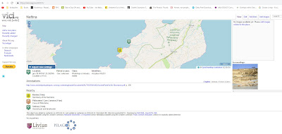
Several of the common digital antiquities databases have very poor or non-existent visualization tools. Their focus is showing you individual sites on a map and with precious little other support. The least satisfactory in this regard is Arthur deGraauw's Harbors project. Dr. deGraauw is an outstanding expert in the field of harbor research; he freely and generously makes his data available to everyone. This data is, however, in the form of a spreadsheet (computer types refer to this as a 'flat file') and no map visualization is possible on his site. The remainder among these various DBs provide a dedicated page for each site along with minimal, mostly useless information about it, but without any larger visualization. The best user interface among these databases is Vici which provides a visualization map for each site and shows you the context. I do notice, though, that when I use Vici that there is often no site description or indication of the site's significance. Here's an example: this shows Neftina on Lemnos which appears to be a quarry although we are not told this:
Vici is actually pretty good and contains nearly everything you want in map visualization. Vici also provides context in the form of other near-by sites. The zoom-level is user controlled and jumping to another site does not require you to go back into outer space before zooming in again.
Multiple Databases
When research involves the several popular databases dealing with antiquity it necessitates running back and forth from one window to the next and trying to put all this data into context.
There must be a better way.
What do we require when visualizing geographic data from antiquity? Ideally we should be able to see all the data simultaneously on one map so the databases are inter-comparable. Is the site coverage around Peristeria in Messenia significantly different between Pleiades and Vici? To answer this question you need these two DBs on the same map so that they can be compared. And each site on this combo-map should link back to the dedicated page which contains more info about that one site. The map itself should be interactive. You should be able to click/tap on it and have it redraw centered on where you've clicked/tapped; restoring the data context at the same time.
We're talking about a lot of data here. The M.A.P. Digital Atlas can display abut 100,000 data points. So when the user looks for one site (Chania on Crete, say) how many surrounding DB sites should be drawn automatically?
Dumping the entire DB is too much. It's time consuming. Most of the DB would not be of concern to the user. And the program response would take a significant hit.
Showing just the individual site is too little. (Pleiades is worst in this regard. P. annoyingly zooms in from outer space for every site search and it never shows any context.)
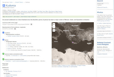 |
Pleiades: Searching for Kydonia.
Phase 1: Outer Space! |
Topostext shows the context around a sought-for site but it also forces the user back into outer space in most instances.)
The Mycenaean Atlas Project Digital Atlas chooses a middle way. What is needed is enough context so that the user can work for an extended period on that specific level (Zoom levels 12-18 in most instances). The Digital Atlas creates and populates a frame which is about 1/5 of a degree in lat and lon. In practice this seems to afford adequate space for investigating the immediate surroundings with little or no detectable drawing time. When the user clicks/taps on the map it is redrawn with the new frame centered at the click. The new frame is filled in from whatever data sets the user has chosen.
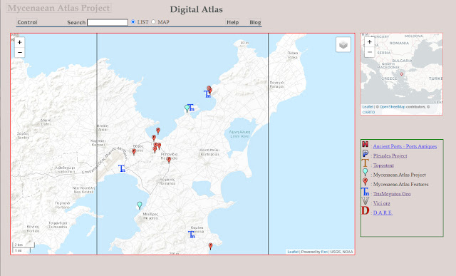 |
Part of Lemnos in the Mycenaean Atlas Project Digital Atlas
Features (red F paddles), M.A.P. sites (Bronze Age) in blue and Trismegistos sites are displayed |
In any solution all the data sets should be visible. In practice, even when limited by a frame, this can produce a great deal of confusing data overlay. The user should, therefore, be able to pick and choose among the various sets - showing all, or none, or some combination. One wants to be able to see what Pleiades has covered as opposed to what Vici has covered, for example. The M.A.P. Digital Atlas features a pull-down menu which allows the user to select as many/few database layers as desired.
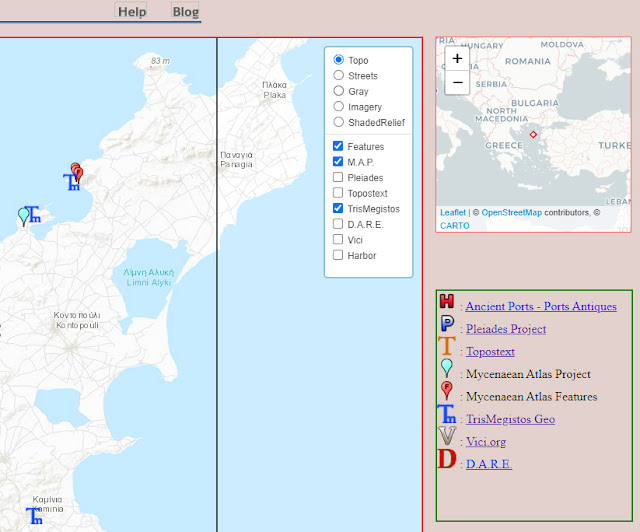 |
The Lemnos map (detail)
Layer Menu visible along with 'spotter' map |
In sum, then, the Digital Atlas from the Mycenaean Atlas Project adheres to the following design features:
- Supports visualization for the following DBs: DARE, deGraauw's Harbors Project, Mycenaean Atlas Project (with features), Pleiades, Topostext, Trismegistos, VICI
- Displays these databases in a frame that is 0.18° 'square'.
- Differential selection among the seven data sets
- Persistent zoom level (user-controlled zoom) (The user is never catapulted into outer space against his/her will)
- User-controlled redraw of the frame by clicking anywhere on the map
- Links from each DB icon to the relevant details page (Pleiades, Topostext etc., even deGraauw's Harbors).
- User-selectable map sheet backgrounds
The result is a quick and easy way to examine coverage for a place (e.g. Siteia on Crete) among the several databases.
I have said that each icon has links to a site details page. Pleiades icon to Pleiades site, Topostext icon to Topostext site, etc. The only exception is Dr. deGraauw's Harbors project. There are no detail pages on his site for individual harbors and so I created a harbor details page for him. Those pages faithfully reflect HIS data. Here's an example:
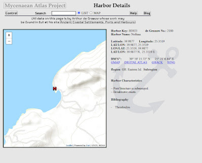 |
Sample detail page for Arthur deGraauw's Harbor data.
This is Neftina on Lemnos |
Looking at this I see that this page should have a 'spotter' map like the Digital Atlas. Always something more to do.
Databases aren't just created for random and unstatable purposes. They are created for reasons. These reasons take their form in the software that is written to execute over them. One thing that is absolutely essential is careful thinking about the user interface and visualization. With awkward or non-existent visualization tools the database is incapable of effectively displaying itself.


